| Moderated by: chrisbet, |
|
|
| Reprocessing Chris's Misty Tuscany photo | Rate Topic |
| Author | Post |
|---|
| Posted by Robert: Tue Feb 11th, 2020 04:07 | 1st Post |
| Chris took this photo in 2018 and posted it on the forum I offered to re-process it but for some reason I didn't, however, it has cropped up again so I have reprocessed it for him, I am sure there are other and better interpretations than my feeble attempts. There would have been more scope for adjustments if it had been an NEF rather than a JPEG. The original JPEG: 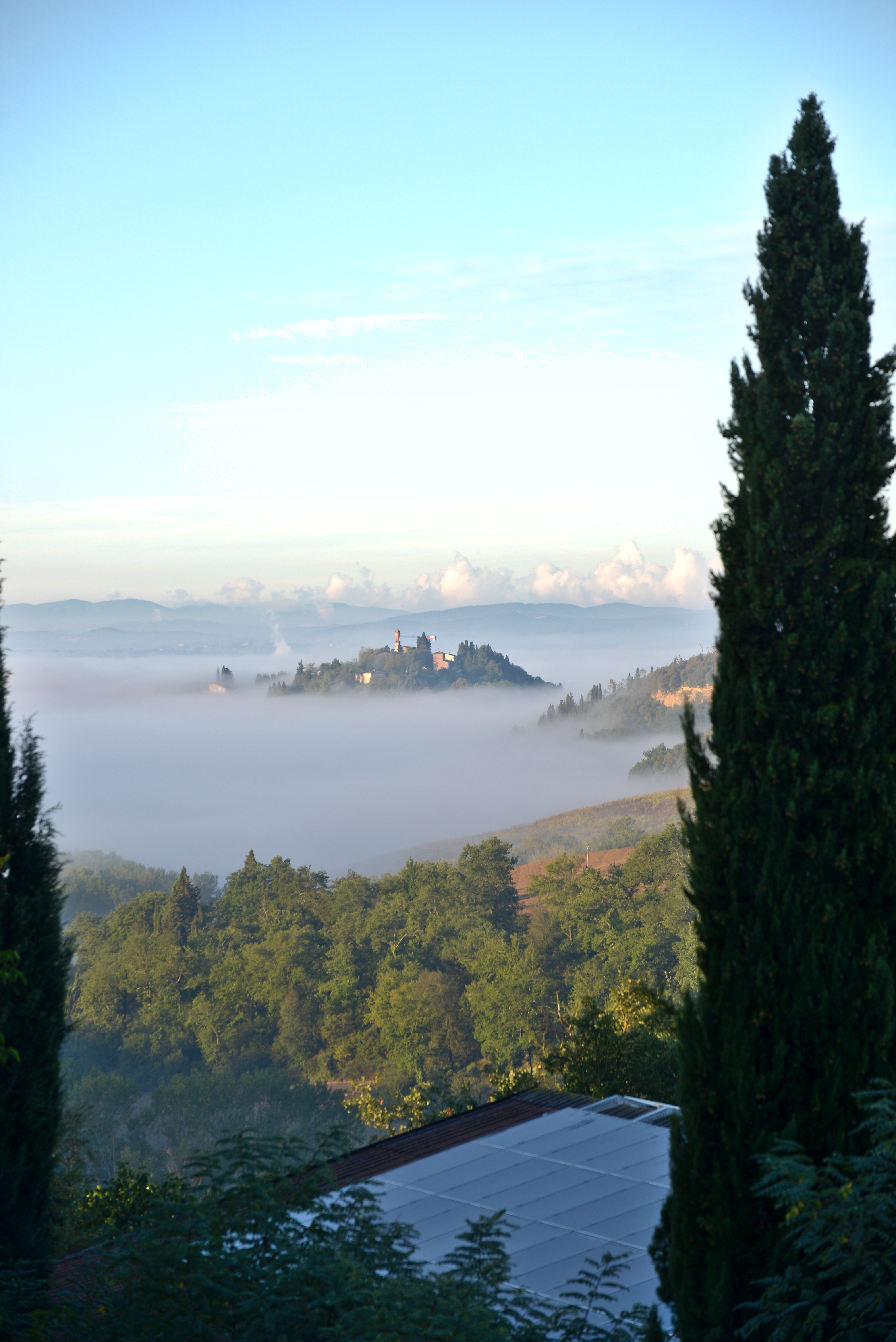 This is my finished image, having used 'Auto' which is an AI process in Lightroom then made minor adjustments to the settings to my taste, applied 'Presence' adjustments, a tad of texture and clarity but increased haze for effect. No sharpening or tone adjustments. Oh, and while I had it in Photoshop to make the border, I removed the pesky crane and an electricity pole... I would like to have taken out some of the height of the rather bland grey cloud but my Ps skills don't extend that far. I may have another attempt later... 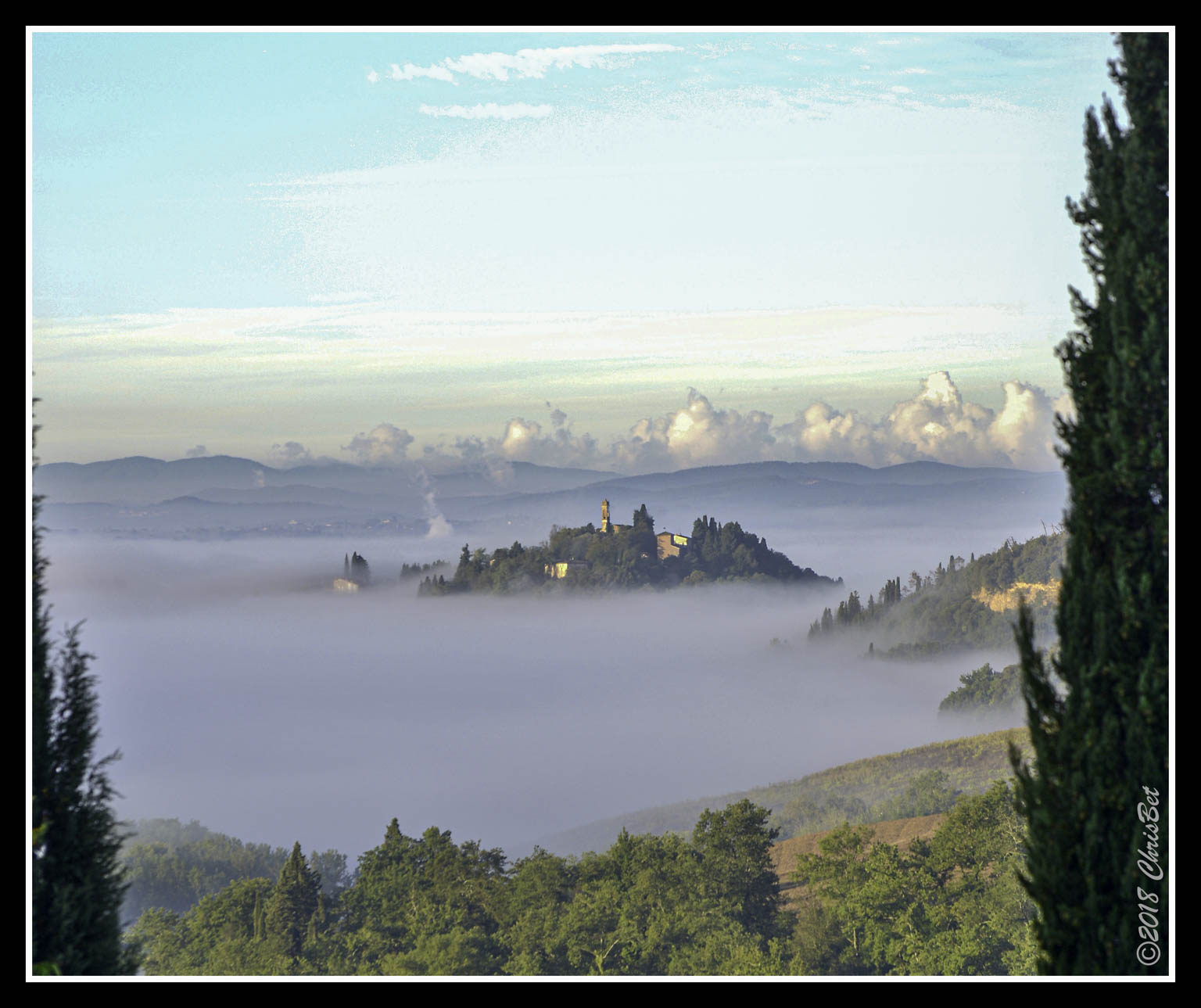 This is a screenshot of the settings in Lightroom before it went into Ps: 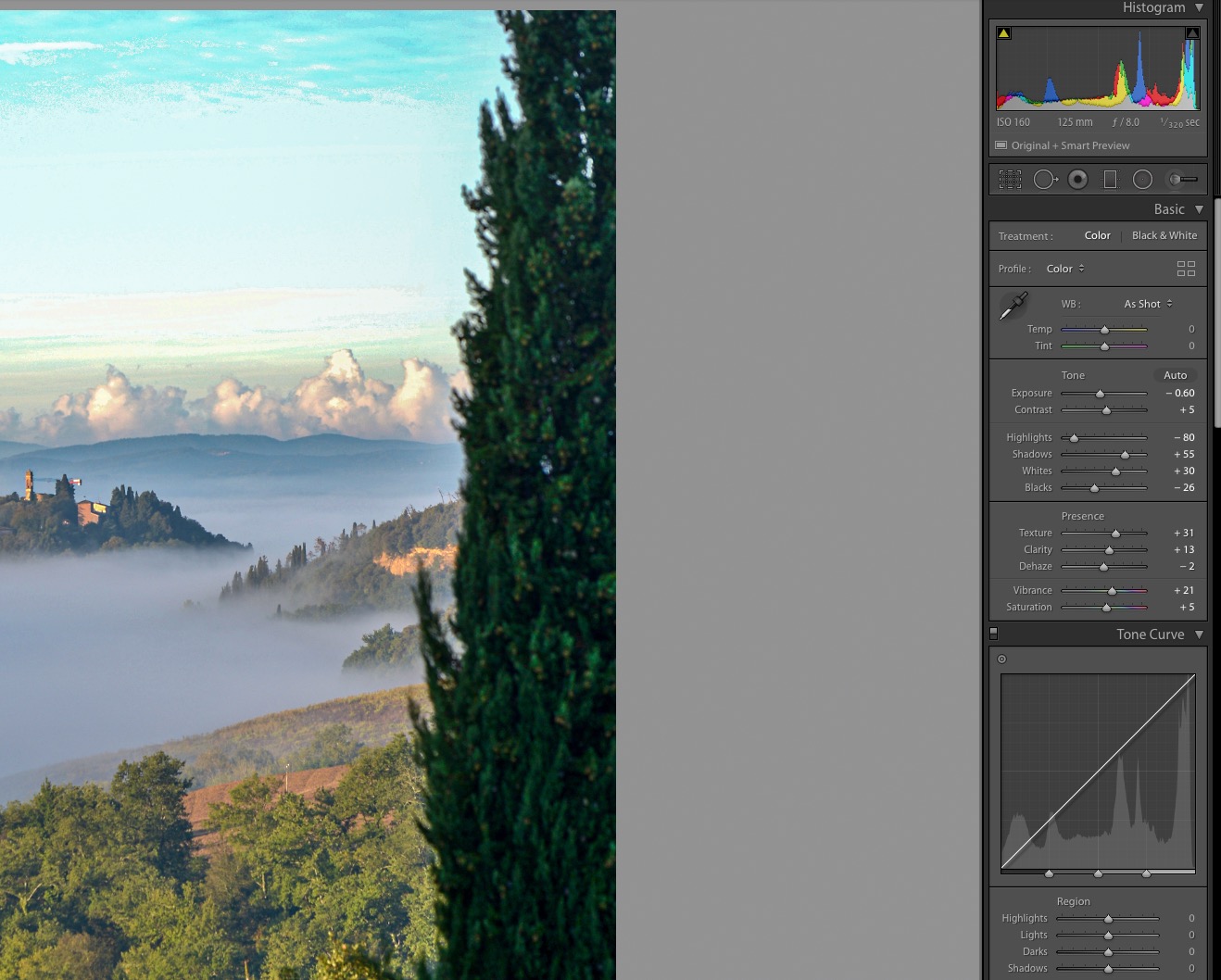
____________________ Robert. |
| Posted by Eric: Tue Feb 11th, 2020 07:20 | 2nd Post |
| It's interesting when you see an image like that, because there are several ways you can look at it. There's no doubt a landscape format is (imho) always better for landscapes ....so cropping to that form is perhaps an obvious first step. You then might consider if the mood of the image should override the perfect maximum total rendition of the image. By that I mean, enhancing the image can lose some of the atmosphere or create atmosphere of a different kind. Forgive me for using your corrected image as an example Robert, but the distant clouds now have heavy outlines. Now I know we should all have silver linings to our clouds but I wonder if softening them might add to the overall ethereal mood? For comparison, is this better or worse......  ...than this...... 
____________________ Eric |
| Posted by Eric: Tue Feb 11th, 2020 07:50 | 3rd Post |
Or maybe a combination?? I guess it's down to personal preference as always.
____________________ Eric |
| Posted by chrisbet: Tue Feb 11th, 2020 09:24 | 4th Post |
| My recollection of the scene I saw with my eyes that led to taking the photo was that the horizon clouds stood out quite clearly and that was what made the view special for me, so personally Eric's first edit is more reminiscent of the moment. Robert's first edit has over "hazed" the mist , which was laying with relatively sharp edges and wisps like Eric's. But thank you both - next time I will make sure I have a NEF file as well!
____________________ If it is broken it was probably me .... |
| Posted by jk: Tue Feb 11th, 2020 10:01 | 5th Post |
| Managed to blow up the post!! This is the image reprocessed in CaptureOne Pro. I reduced the greyness in the hills. 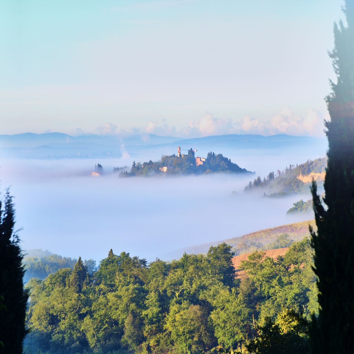 Click here to comment or read comments on this image Then the above taken into Photoshop for a quick sharpen and a bit of blue hour treatment. Maybe OTT. 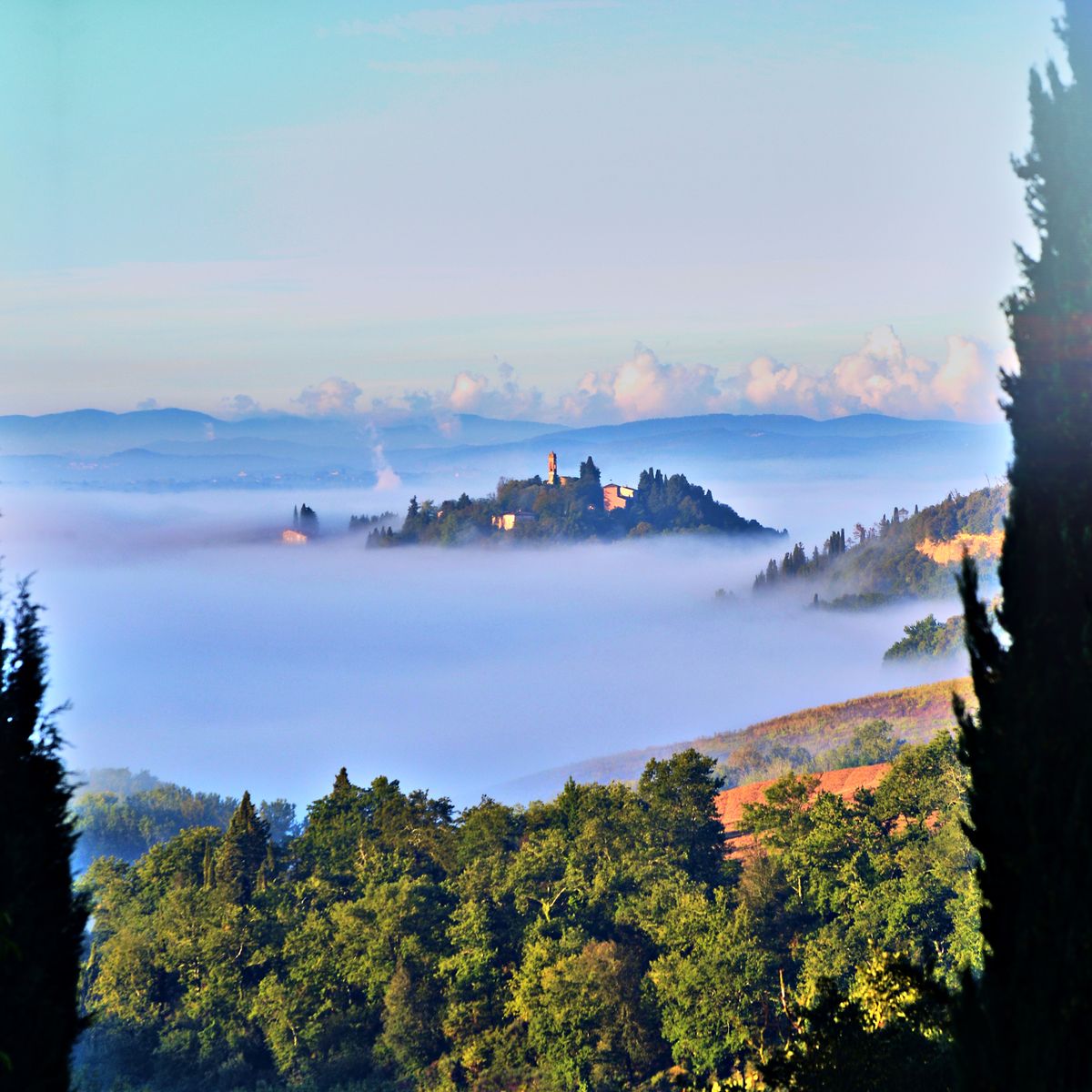 Click here to comment or read comments on this image
____________________ Still learning after all these years! https://nikondslr.uk/gallery_view.php?user=2&folderid=none |
| Posted by chrisbet: Tue Feb 11th, 2020 10:03 | 6th Post |
| Best yet - but I think I would lose the framing trees - there is a colour change on the horizon line on the right tree ...
____________________ If it is broken it was probably me .... |
| Posted by jk: Tue Feb 11th, 2020 12:19 | 7th Post |
Alternative version all edits in Photoshop CS6.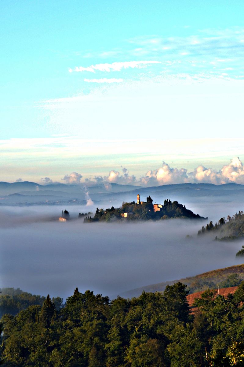 Click here to comment or read comments on this image
____________________ Still learning after all these years! https://nikondslr.uk/gallery_view.php?user=2&folderid=none |
| Posted by chrisbet: Tue Feb 11th, 2020 16:39 | 8th Post |
| Good one JK - brings back great memories.
____________________ If it is broken it was probably me .... |
| Posted by jk: Wed Feb 12th, 2020 08:31 | 9th Post |
| I find the pale cyan sky a real challenge to the edits as if I get the sky right then the rest of the image looks rubbish and vice versa.
____________________ Still learning after all these years! https://nikondslr.uk/gallery_view.php?user=2&folderid=none |
| Posted by Robert: Wed Feb 12th, 2020 10:19 | 10th Post |
jk wrote:I find the pale cyan sky a real challenge to the edits as if I get the sky right then the rest of the image looks rubbish and vice versa.A bit of graduated masking might help?
____________________ Robert. |
| Posted by jk: Wed Feb 12th, 2020 11:35 | 11th Post |
| Tried that but it looks strange.
____________________ Still learning after all these years! https://nikondslr.uk/gallery_view.php?user=2&folderid=none |
| Posted by Eric: Wed Feb 12th, 2020 16:43 | 12th Post |
jk wrote:Tried that but it looks strange.You need to switch to cmyk and then channel mixer 
____________________ Eric |
| Posted by jk: Wed Feb 12th, 2020 17:08 | 13th Post |
| Yes that looks better. Thanks Eric. Need to understand the why of this. Do you have a link to a tutorial? Thanks
____________________ Still learning after all these years! https://nikondslr.uk/gallery_view.php?user=2&folderid=none |
| Posted by Eric: Wed Feb 12th, 2020 17:18 | 14th Post |
jk wrote:Yes that looks better.No Jonathan. Just switching to CMYK enables you to work exclusively on the offending Cyan channel instead of RGB. Channel mixing is a quick way to swop colours...like doing IR. If you do it on a duplicate layer you can isolate the sky region and then blend opacity to modify the change if desired.
____________________ Eric |
| Posted by jk: Wed Feb 12th, 2020 17:29 | 15th Post |
| Thanks Eric. That makes sense. I will give it a go.
____________________ Still learning after all these years! https://nikondslr.uk/gallery_view.php?user=2&folderid=none |
| This is topic ID = 1788 | ||
| Nikon DSLR Forums > The Image Processing and Editing Forums > Software, techniques and tips for image publishing > Reprocessing Chris's Misty Tuscany photo | Top | |
Users viewing this topic |
||
Current theme is Blue
| A small amount of member data is captured and held in an attempt to reduce spammers and to manage users. This site also uses cookies to ensure ease of use. In order to comply with new DPR regulations you are required to agree/disagree with this process. If you do not agree then please email the Admins using info@nikondsl.uk Thank you. |
Hosted by Octarine Services
UltraBB 1.173 Copyright © 2008-2025 Data 1 Systems
Page processed in 0.1452 seconds (67% database + 33% PHP). 109 queries executed.
UltraBB 1.173 Copyright © 2008-2025 Data 1 Systems
Page processed in 0.1452 seconds (67% database + 33% PHP). 109 queries executed.